What is Design Now?
Design as he says is a combination of “art”, technological
advances and capabilities and the core factor of design principles.
He is fascinated by new technology, he loves to play with it
and see what he can create using this new material. Dawes found the film
“I-Pencil” especially inspirational, as it shows the process and development of
how the pencil is created from start design to final product. He talks about
how such a seemingly simple product can actually have a lot of thought and
processes put into producing it.
When producing his own work he aims to create designs that
give a visceral reaction, he wants that interactivity between the design and
the viewer. He says even if this ends up being a negative reaction, it’s at
least a reaction and that shows his design has fulfilled its purpose.
He presented to us a selection of his work and explained his
ideas and process regarding such. I found this interesting and was interested
in the way in which he explores different medium and finds inspiration.
One example of his work was that of his search engine in
which you would doodle lines to bring up new results from those entered and
this would create a mind map layout of Internet search results. He points out
that this design would be horrendous for something such as Amazon as you would
have to spend ages to find the best deal. However, his aim for this project
which was created around 10 years ago now was to present search results to internet
users to which they may not have otherwise come across and as a concept and
perhaps an intriguing playful term search this worked. A further piece he
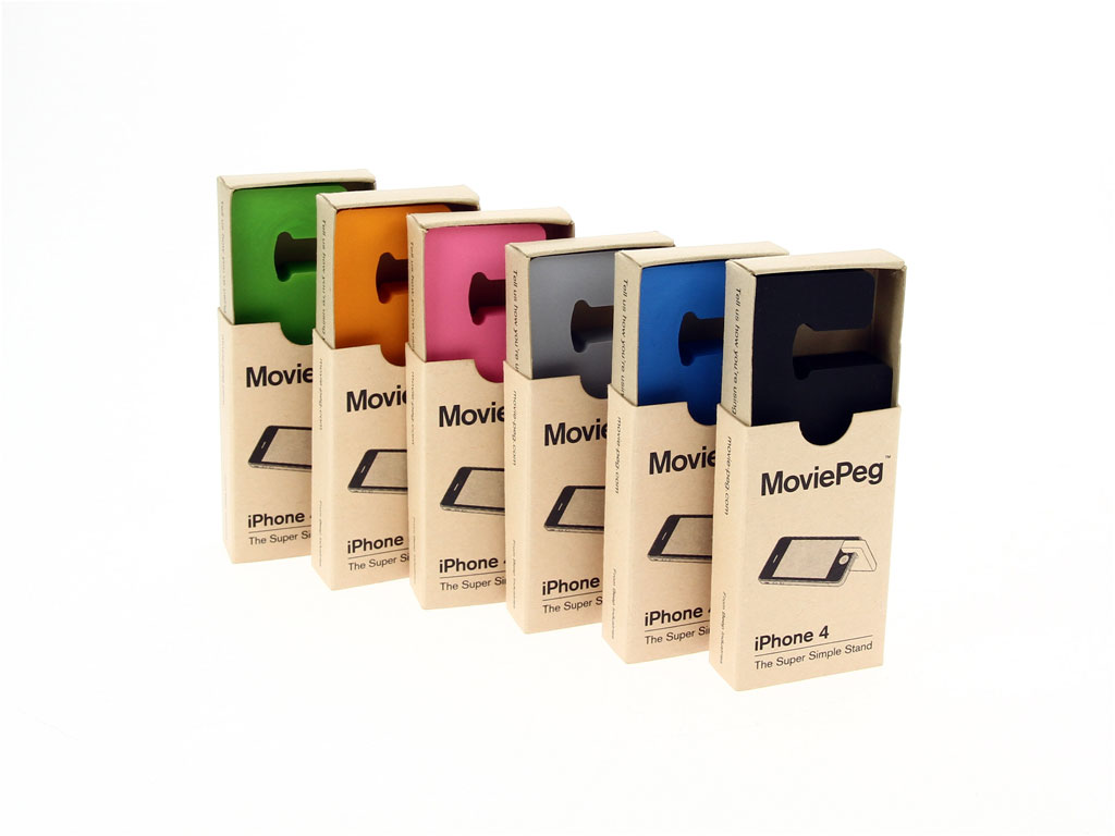
designed was that of the IPhone stand “MoviePeg”, created as a solution to a
problem he came across within his own experience of using the IPhone to watch a
video he found he always had to balance it against something as to be able to
watch it effortlessly as a screen. Due to this he decided to create a solution
himself and brought out this relatively simple yet intuitive design for
“MoviePeg”.
 |
| Brendan Dawes - MoviePeg |
His point for talking about such as these was to highlight
the iteration process as being one of high importance, even if you circle round
to your initial idea it shows clients that you do have alternatives and that
you can create multiple solutions to a problem. Therefore Dawes champions the
online portfolio of work and particularly likes when people show their process
and production work within their blogs. This is because rather then just seeing
the final products within a portfolio, he would rather see the process and the
mind of the designer at work as to give him a clearer idea as to whether they
are right for the job before hiring them.
He shares the viewpoint of the modernists to a degree in the
way of minimalism and this is displayed in his promotion of Antoine de
Saint-Exupery’s phrase that “Perfection is Achieved Not When There Is Nothing
More to Add, But When There Is Nothing Left to Take Away”. This has the upmost
relevance to design, especially so I would say to Product design and if
something has nothing left to remove then ideally the design should be to all
intents and purposes simple to use and yet completely capable to carry out its
purpose while still being able to be attractive through the designers use of
colour and form. With hearing this it is no surprise then that Dawes Iphone and
Ipad stands are minimalist in form and therefore simple and also highly
accessible due to reduced production costs.
At the end of the lecture he opened it up to questions so I
asked him how long his usually last for with them being experimental in nature
and also what he finds inspiring. He answered the first question with it
varying, it all depends on what sort of project he is working on, on some it
can takes months, for example one electronic project took months to complete as
he was programming the software and building the device, whereas others can
take a few weeks. The latter question he replied with anything! Question
everything, its good to be curious. Dawes also spoke about how he copes with
time management explaining that if he isn’t in the flow of creativity he takes
a break and finds the ideas start to come to him. What he says here reflects
what my tutor John advises us to do in regards to note-keeping, he advises us
to try and keep a small notebook at side of us as ideas can come at the most
random of time through general thought process and this co-insides with the unconscious
mind processing the days activity and challenges.
Finally Dawes spoke about how he receives his work, he said
he receives most of his due to a mixture of his website, reputation and word of
mouth and he also actively gets involved in conferences and the likes of nexus.
He also mentioned that you need to stand for something in order to get noticed,
what is your focal point? What is your main area of interest? What are your
strengths? Promote these and be organised and have good communication skills.
 |
| Brendan Dawes - 3D Data Visualisation Frequency Data Used From the Following Track: Arctic Monkeys - I Bet You Look Good On The Dancefloor |
Review of Lecture
I found this lecture to have concentrated on very
experimental ways of design both in product design and that of information
visualisation and found learning the ways in which Dawes goes about his process
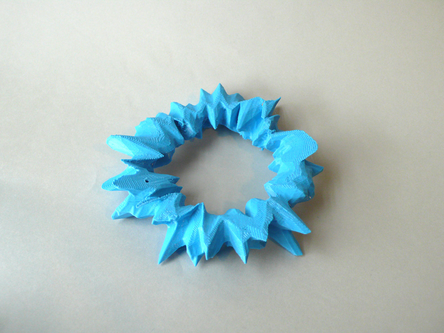
inspiring and interesting to learn about. His use of digital data becoming
merged with 3D physical forms I found very engaging and an interesting take of
visualising data, especially with the capabilities of 3-D printing. I found his
advice to be particularly inspiring and of use and intend to keep it in mind
for future reference and any periods in which I may find myself struggling.

